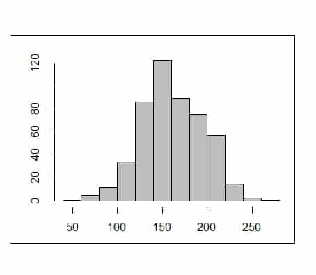
Bar plot and histogram.

We review the differences between bar plots, useful for representing qualitative variables, and histograms, for quantitative ones.
What an egg and a chestnut look alike?. If we fired our imagination we can give some answers as absurd as stilted. Both are more or less rounded, the two can serve as food and both have a hard shell that encloses the part that is eaten. But in fact, and egg and a chestnut don’t resemble each other at all, even though we want to look for similarities.
The same thing happens to two graphic tools widely used in descriptive statistics: the bar chart and the histogram. At first glance they may look very similar, but if you look closely there are clear differences between the two types of graphs, which enclose totally different concepts.
Types of variables
We know that there are different types of variables. On the one hand there’re quantitative variables, which may be continuous or discrete. Continuous are those that can take any value within a range, as with the weight or blood pressure (in practice, possible values may be limited due to the precision of the measuring devices, but in theory we can find any weight value between the minimum and maximum of the distribution). Discrete variables are those that can only take certain values within a set, for example, the number of children or the number of episodes of myocardial ischemia.
Furthermore, there are qualitative variables that represent attributes or categories of the variable. When the variable does not include any sense of order, it is said to be a qualitative nominal variable, whereas if you can establish some order among the categories you will say that it is a qualitative ordinal variable. For example, smoking will be a qualitative nominal variable if it has two possibilities: yes or no. However, if we define the variable into categories like casual, slightly smoker, moderate or heavy smoker, there will be a hierarchy among the categories and it will be an ordinal qualitative variable.
Bar plot
Well, the bar graph is used to represent ordinal qualitative variables. The horizontal axis represents the different categories and over it are drawn a series of columns or bars whose heights are proportional to the frequency of each category. We could also use this type of graph to represent discrete quantitative variables, but what is not right to do is to use it to plot nominal qualitative variables.
The great merit of the bar chart is expressing the magnitude of the differences between the categories of the variable. But that is precisely its weakness because they are easily manipulated by modifying its axes. As you can see in the first figure, the difference between short and occasional smokers seems much higher in the second graph, in which we have miss out part of the vertical axis. So be careful when analyzing this type of graph to avoid being deceived with the message that the author of the study may want to convey.
Histogram
Moving on, the histogram is a graph with a much deeper meaning. A histogram is a frequency distribution that is used (or should) to represent the frequency of continuous quantitative variables. This is not the height, but the area of the bar which is proportional to the frequency of that interval, and is related to the probability with which each interval may occur. As you can see in the second figure, columns, unlike in the bar chart, are side-by-side and the midpoint gives the name to the interval. The intervals need not to be all of the same width (although it is the most common situation), but they will always have a larger area the more frequent those intervals are.
In addition, there’s another very important difference between the bar graph and the histogram. In the first graph there’re represented only those values of the variable than have been observed in the study. Meanwhile, the histogram goes much further, since its represents all the possible values that exist within the range, although we haven’t seen some of them in a direct way. So, it allows calculating the probability of any value of the represented distribution, which is very important if we want to make inference and to estimate population’s values from the result of our sample.
We’re leaving…
And here we leave these graphs that may look the same but, as we’ve shown, seem like an egg to a chestnut.
Just one last comment. We’ve said at the beginning that it was a mistake to use a bar chart (or, of course, histograms) to represent nominal qualitative variables. And what can we use for that?. Well, a sectors’ chart, the famous and ubiquitous pie that is used on more occasions than the proper and that has its own idiosyncrasies. But that’s another story…


