Visual manipulation of data.

Visual manipulation of data using poorly designed charts can distort data interpretation. The most common errors, such as missing axes, manipulated scales, and confusing pie charts, are described, which can lead to erroneous conclusions. Learning to detect these errors will allow us to improve our ability to visually analyze and interpret data.
Ah, the age of the mobile phone! Somewhere in the world, there’s bound to be someone claiming that their brand-new smartphone takes photos as good as a professional camera (or even better, believe it or not). And I, who’s an astronaut in my spare time, wonder: who needs an expensive mirrorless camera when you can capture the majesty of life with the touch of a screen?
Indeed, we live in an age where any high-end phone promises professional-grade photos. Manufacturers boast of their incredible algorithms, multiple cameras, and millions of megapixels, but when you look at the result up close, not everything is as perfect as it seems.
Photos may look flawless on a mobile screen, but when you zoom in or compare them to those of a professional camera, the flaws emerge. So what about those little technical details that mobile phones supposedly master?
I wonder if the magic of software, infinite megapixels, and that artificial intelligence that promises to turn every selfie into a work of art corresponds to a tangible truth. Or are we being fooled by the glitz and glamour of marketing?
And this is where things get interesting, because this photographic illusion leads us to an equally intriguing topic: the visual manipulation of data in statistics. Just like with the photos on our phones, graphs can look impressive and compelling at first glance, giving the impression of precision and quality.
But a deeper look can reveal the pitfalls and errors that may distort our understanding, hiding important truths. A graph that looks simple and straightforward may be fudging the data, exaggerating minute differences or distorting the scale to make something insignificant seem critical.
If you continue reading this post, you will learn to recognize some of the most common pitfalls in visual interpretation of graphs, which will help you see “beyond the image,” just as you would with an overly retouched photo.
Without zero, there is no truth
One of the most common traps is to subject the axes, especially the horizontal one, to a perverse effect of gravity, so that the scale of the ordinate axis (the y axis) does not start at zero and, more commonly, the x axis floats towards the heavens of the diagram.
This is often seen with bar graphs that, at first glance, seem to innocently show us huge differences between the categories compared, as we see in the graph on the left of the first figure. However, if we look closely, we see that the axis has been trimmed, skipping the zero, amplifying the differences in a misleading way.
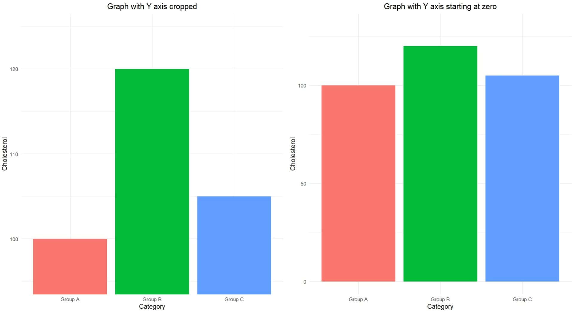
If the graph started at zero, as we see in the one on the right, the differences would seem much less dramatic than in the trimmed graph. Those of you who are suspicious will not be able to avoid concluding that the author of the graph has tried to make us believe that the difference is much more important than it really is.
So here we learn a first lesson: we must always check that the axes of the graph start at the origin of the coordinates and, if not, ask ourselves if the difference shown is really as important as it seems.
When the pie becomes indigestible
The pie chart is also a frequent victim of cheating authors.
Pie charts are a popular visual aid for their neat and colourful appearance. However, when there are more than a few categories, these charts can become incredibly difficult to read.
Our limited brains are not well trained to compare curved areas, which means that small differences between slices of the chart can go unnoticed or appear larger than they are.
Imagine a pie chart that shows 10 categories, all in bright colours, like the one on the left in the attached figure. Can you really accurately tell which one is the largest? Probably not. If two slices are similar in size, identifying which is larger can become a frustrating exercise.
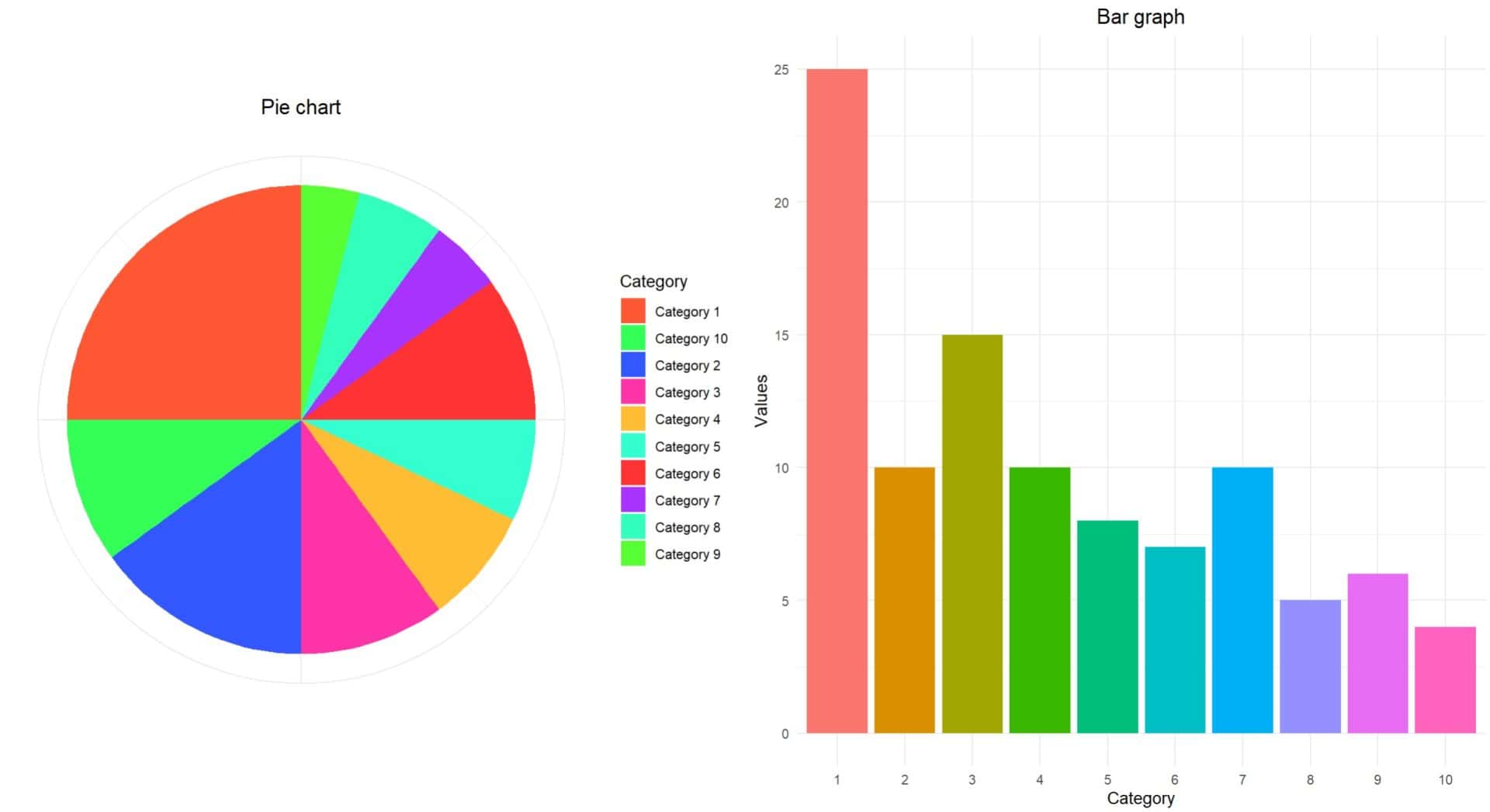
In these cases, it will always be better to use a bar chart, which will make it easier to make comparisons between the different categories, as you can see in the chart on the right. But without cheating with the axes, as we already know.
Adjusting reality with a ruler
Another very useful resource is the manipulation of the scaling of the axes, using scales that do not fit well with the data presented.
For example, logarithmic scales (where the values are compressed) can be used to make large changes appear smaller. This can be useful in some scientific contexts, but if applied without explanation, it can be misleading if the graph is viewed superficially.
Imagine a pharmaceutical company that has carried out a study with a new drug for the treatment of the serious disease fildulastrosis, giving its drug to the 1000 participants in group A and the usual treatment to the 1000 in group B. Once it manages to demonstrate that the new drug is not inferior to the usual treatment, it studies its effects on the length of hospital stay, measuring the number of patients who remain hospitalized throughout the first 10 days of treatment.
These results are shown in the graph on the left of the following figure.
At first glance, we can see that there are few differences in the number of patients admitted at the end of the period in both arms of the trial. Although the decrease is somewhat greater in group B, both groups decrease only slightly and the difference between the two groups seems to be insignificant.
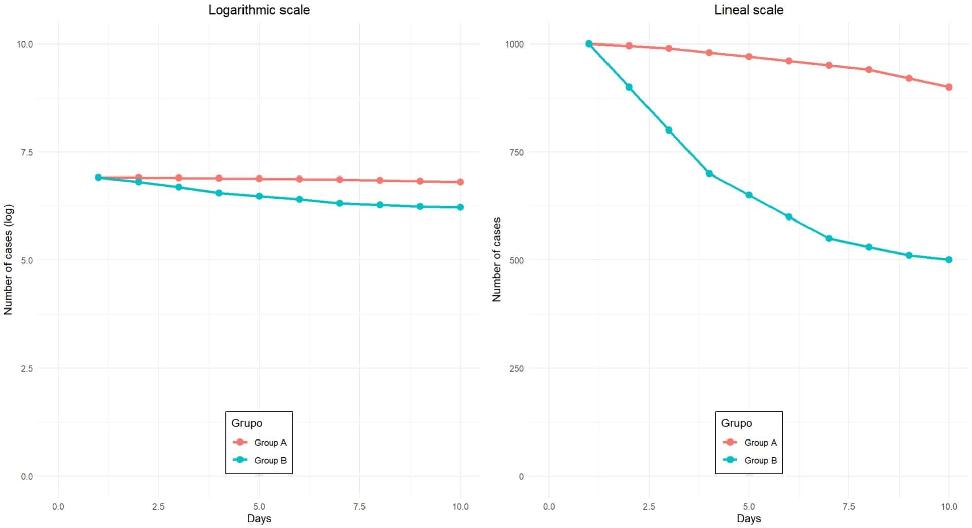
But if we look closely, we will notice that the scale of the y-axis has a logarithmic transformation. Why would they have done this? I would say that the type of data represented does not make this transformation necessary.
On the right-hand side I show you the same graph, but with both axes on a linear scale. At a glance we see that the interpretation is quite different. While in group A there is a slight reduction of 10% in the number of patients admitted, this is 50% in group B of the usual treatment. Here it does seem that there is a relevant difference between the two treatments, in favour of the usual treatment.
In summary, the lesson we learn from this example is that we will always have to assess the suitability of using a transformation of the scale of the axes. Logarithmic scales do not distribute values evenly, but rather compress large changes so that visually the differences appear smaller than they really are.
When what’s missing is what’s misleading
Another form of deception with graphs is to deliberately omit the context of the data being represented. Just as a spectacular photo can mislead you about the beauty of a place (without showing you that there’s a polluting factory just outside the frame of the photo), graphs that don’t include all the information can mislead you to wrong conclusions.
Imagine a graph is presented showing a significant reduction in mortality rates for patients treated with a new drug for fildulastrose, as shown in the diagram on the left in the following figure. The graph shows that mortality decreased from 45% to 30% over the past five years, which seems like a remarkable advance.
However, what the authors forget to show is that, over that same time period, improvements in general medical care and the introduction of new procedures unrelated to the drug also reduced mortality rates in all published patient series, even in those not treated with the drug in question.
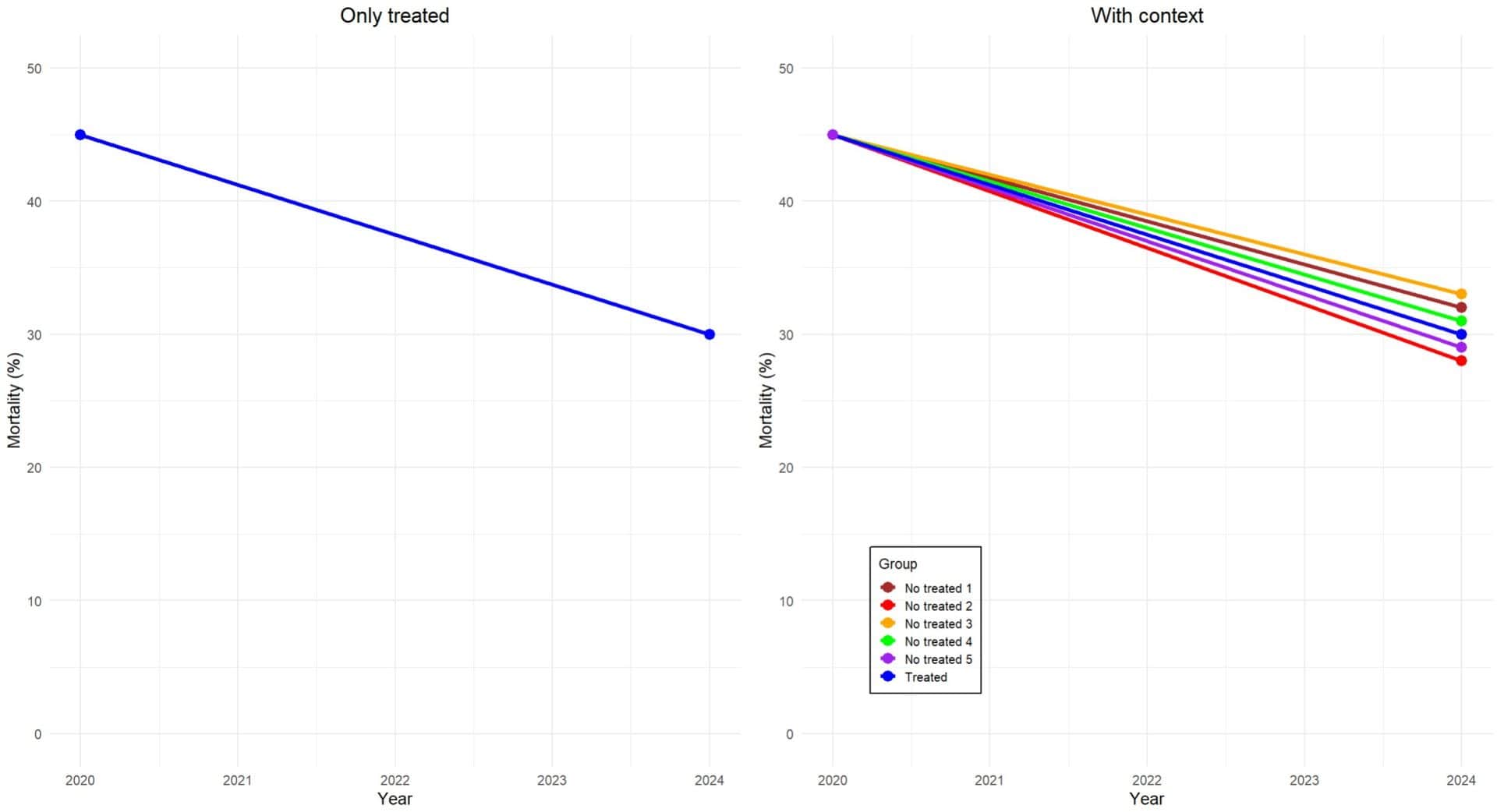
If the graph included the context of overall treatment advances, it would be clear that the reduction in mortality was not due to the drug alone. The missing context creates the false impression that the drug is the sole cause of this improvement, when in fact, other factors also played an important role.
Moral: always assess whether the graph provides all the information necessary to gauge the importance of the effect it seeks to demonstrate, lest they are trying to overvalue the intervention.
When the axes are missing, the conclusions are distorted
Another common trick is to hide or modify the axes of a graph so that the data presents a distorted image. Scatter or line graphs, in particular, can show “trends” that do not really exist if the axes are not labelled properly or certain units are omitted.
Returning to our perfidious pharmaceutical laboratory, let’s imagine that, this time, it presents us with a line graph to demonstrate the effectiveness of a new drug that reduces blood cholesterol levels, as you can see in the graph on the left in the following figure.
This graph shows a drastic drop in cholesterol levels among people who took it for 6 months. But notice one detail: the y-axis is not labelled: the labels are missing, the units of measurement are not specified, we do not know what range of values it covers… Why did they do it this way?
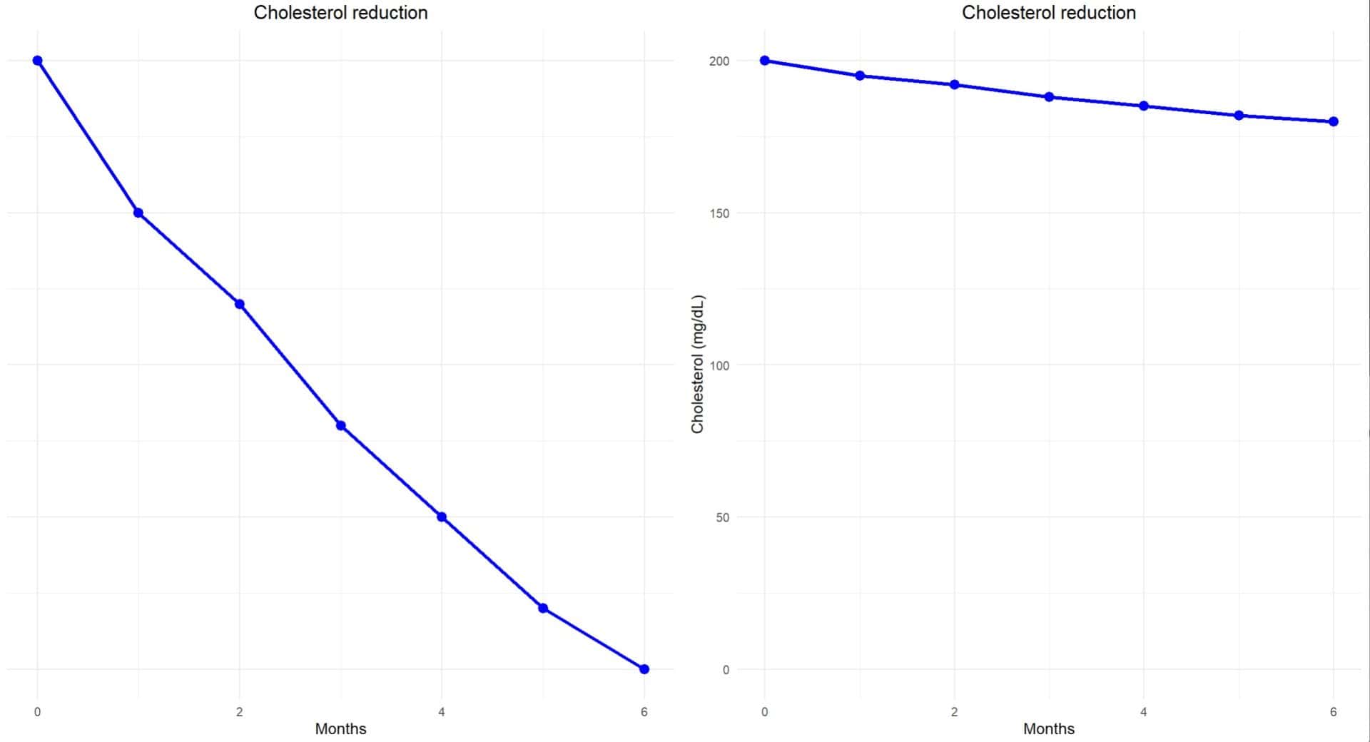
The answer is in the graph on the right, made with the same cholesterol data. In addition to starting at 180 mg/dl instead of zero, we see that the value drops from 200 mg/dl to 180 mg/dl. It no longer seems so drastic, and we quickly understand what is being sought by omitting the axis labels.
This example teaches us that manipulation or lack of clarity in the axes can lead to errors in the interpretation of the graph. Without well-labelled axes, it is easy to fall into the visual trap of exaggerating the results.
When visual excesses confuse
To finish, we will refer to those situations in which there is a real abuse of visual resources, such as 3D effects, a great diversity of colours and shapes, shadows, etc., all of which is favoured and made possible by the power of the graphic programs available today.
Just as Instagram filters can make a normal photo look like a masterpiece (or, on other occasions, a grotesque disaster), the excessive use of colours and effects in graphics can distract and confuse more than help. Graphics with too many colours or with an unnecessary use of shadows, gradients and textures can make interpretation difficult and give a feeling of chaos.
A wise recommendation may be to use sober and consistent colours in the graphics. If you need to compare several categories, we will choose a limited colour palette that facilitates comparison.
We’re leaving…
And with this we are going to end this very tricky post.
We have seen some of the bad uses of graphics that, due to ignorance of their use or for unspeakable intentions, can transmit information that does not correspond to the real information provided by the data with which the graph is made.
It will be good to follow a series of steps such as checking the axes and scales of the graphs, distrusting graphs that omit important contexts or seem too ornate and preferring bar or line graphs over circular or pie charts for precise comparisons.
Just like when we talk about photography, the beauty of numbers is in their clarity, not in their superficial shine. And remember Susan Sontag’s phrase: that photographs are often praised for their truthfulness, their honesty, indicates that most photographs, of course, are not truthful. Always look at the data, not just at the graph.
And now we are off. We haven’t talked about another mistake that can be made when creating a graph, such as using the wrong graph for the type of variable we want to represent and confusing pies with bars or bars with histograms, to give a few examples. But that’s another story…
